12 Key Product Design Principles Every Product Manager Should Master
Ever found yourself trapped in the endless scroll of Instagram Reels or swiping on Tinder, only to realize an hour […]
Ever found yourself trapped in the endless scroll of Instagram Reels or swiping on Tinder, only to realize an hour has flown by?
Yeah, we’ve all been there… well, at least those of us with smartphones and not practicing Zen in the mountains.
So, what’s behind this addiction?
The answer is pretty simple- that’s great product design doing its job!
Apps like Instagram, Tinder, or even Duolingo have cracked the human brain code. They know precisely how to keep you hooked by putting smart, thoughtful product design at the very center of every single tap, swipe, and scroll.
And here’s the thing- this isn’t just about making apps look good. It’s about creating experiences so intuitive and addictive that you can’t help but come back for more. No wonder product design is one of the most popular topics in product management interviews.
In fact (no pun intended), one of our cohort members from the AI Product Management course recently faced these tricky questions during an interview-
- How would you design a web search engine that doesn’t let kids under 14 accidentally Google “How to become Spider-Man,” but still feels fun and magical?
- How would you design a bicycle rental app for tourists who can’t even pronounce the city names they’re visiting- and always forget where they parked?
We can all agree that these weren’t some usual “tell me about yourself” questions. Nope.
They were the kind of questions that make you think like a real designer.
They’re meant to test if you truly understand the principles of product design- the invisible rules that make experiences addictive, intuitive, and unforgettable (more on this as we dive deeper into the blog).
But hold up for a second. Before we start pulling apart those principles, let’s ask something basic yet powerful: What is product design, really?
If we had to describe it in the simplest words, we’d call it the Fevicol that holds everything together- user needs, business goals, and that “it just works” feeling. It’s part psychology, part usability, part aesthetics- and all of that comes together to turn a simple idea into something people can’t imagine living without.
And behind all this magic comes the hero of our story today- product design principles.
Now, let’s get one thing clear- these principles aren’t just about making something pretty; in fact, they are much more than that.
Product design principles shape the way a product feels, the way you use it, and the way it quietly solves your problems. They define usability, functionality, accessibility, and those subtle micro-interactions that make you say, “Wow, this is smooth.”
So, grab your coffee. In this guide, we’re diving into 12 product design principles that will help you create great design for your next product. Here’s a sneak peek of what this design blog will cover:
Table of Contents
What are Product Design Principles, and Why Do They Matter for Great Design?
In its simplest form, product design principles are the behind-the-scenes rules that turn good ideas into great experiences. They shape how a product is structured, how it works, and most importantly, how it feels when you use it. These principles are what transform a product from “just functional” to something that’s usable, lovable, and downright unforgettable.
It’s like having your own North Star when you’re knee-deep in building a new feature, fixing a confusing onboarding flow, or sifting through user feedback.
Product design principles don’t just tell you how to make things look pretty; they help you find that sweet spot where user needs, business goals, and technical constraints all click together. That’s when you get great design, the kind that not only works but leaves a lasting impact.
Key Takeaway
Product Design Principles are the guiding rules that turn a functional idea into a product users love, shaping usability, look, feel, and overall experience while keeping teams aligned.
Why Product Managers Need to Understand the Principles of Product Design?
Great products aren’t built by accident, they’re built by teams, and especially by product managers, who understand product design principles.
As a PM, knowing these principles doesn’t just make you sound smart in meetings; it helps you shape products that users genuinely want to use.
Still not convinced? Here’s why every product manager should invest time in learning these principles:
- You can write more effective PRDs that confuse no one
When you understand product design principles, you can translate user needs into clear, actionable features. Your PRDs become sharper, easier to follow, and less likely to get lost in translation between design and engineering teams. - Help in bridging the gap between product, design, and engineering
A PM who “gets design” is like glue in the product process. You can give feedback that matters, contribute meaningfully during design critiques, and align everyone around a shared vision of great design. - Champion great UX (even without a design team!)
Startups and fast-moving teams don’t always have a dedicated designer. But when you know the principles of product design, you can still advocate for intuitive, clean user experiences that make a real impact. - Ace design-focused interview questions
Product interviews often test your design thinking. Questions like “How would you design a food delivery app for elderly users?” are much easier to nail when you can draw on accessibility, simplicity, and user-centered design principles.
Key Takeaway
PMs who know these principles can write clearer PRDs, align design and engineering teams, advocate for better UX, and confidently answer design-focused interview questions.
The 12 Key Product Design Principles for Creating Great Products (Real-World Examples)
1. User-Centered Design – Because Your Users Are the Real Bosses
At its core, user-centered design (UCD) is all about obsessing over your users – their needs, preferences, and quirks – throughout the product development journey. When you prioritize solving real user pain points instead of just building “cool features,” your product naturally delivers more value.
Real-World Example: Ever wondered why Uber introduced upfront pricing?
Through user research, Uber discovered that riders were frustrated by not knowing the final fare until the trip ended. By displaying the fare upfront, Uber solved a key pain point, improved transparency, and built deeper trust with users. That’s UCD in action.
2. Accessibility – Design That Includes Everyone
Great design isn’t great if it leaves people out. Accessibility ensures that your product can be used by all users, including people with disabilities, by incorporating thoughtful design features that make the experience inclusive.
Real-World Example: Google’s productivity suite (Docs, Sheets, Slides) doesn’t just look sleek – it works seamlessly with screen readers, braille devices, and screen magnifiers. This commitment to accessibility means their tools are usable by anyone, regardless of ability.
Accessibility for Google Docs, Sheets, Slides & Drawings

3. Consistency – Because Users Love Familiarity
Consistency is like that friend who always shows up on time – reliable and predictable. In product design, consistency means keeping your layouts, navigation, and terminology uniform across the product. This reduces cognitive load, letting users focus on what they need to do instead of figuring out how to do it.
Real-World Example: Think about Microsoft Office. Whether you’re working in Word, Excel, or PowerPoint, the ribbon interface always looks and feels familiar. Even though each tool has its own context, the way you accomplish tasks stays the same. This consistency builds confidence, allowing users to work faster without constantly relearning the interface.
4. Simplicity – Less Clutter, More Clarity
Simplicity isn’t about stripping things down to bare bones – it’s about removing the unnecessary so that what’s left feels effortless. A good product design principle is to ask: “Can I make this experience simpler without losing value?”
Real-World Example: Apple nails this with iOS. From the clean home screen to intuitive gestures like swiping and tapping, everything feels natural. By keeping only the essential apps upfront and removing visual clutter, iOS remains accessible even for users with zero tech know-how. Simplicity here equals usability.
5. Visual Hierarchy – Show Users What Matters First
Your product interface is like a conversation – you need to guide the user’s attention to the important stuff first. That’s where visual hierarchy comes in. By prioritizing elements (size, color, placement), you help users instinctively know where to look and what action to take.
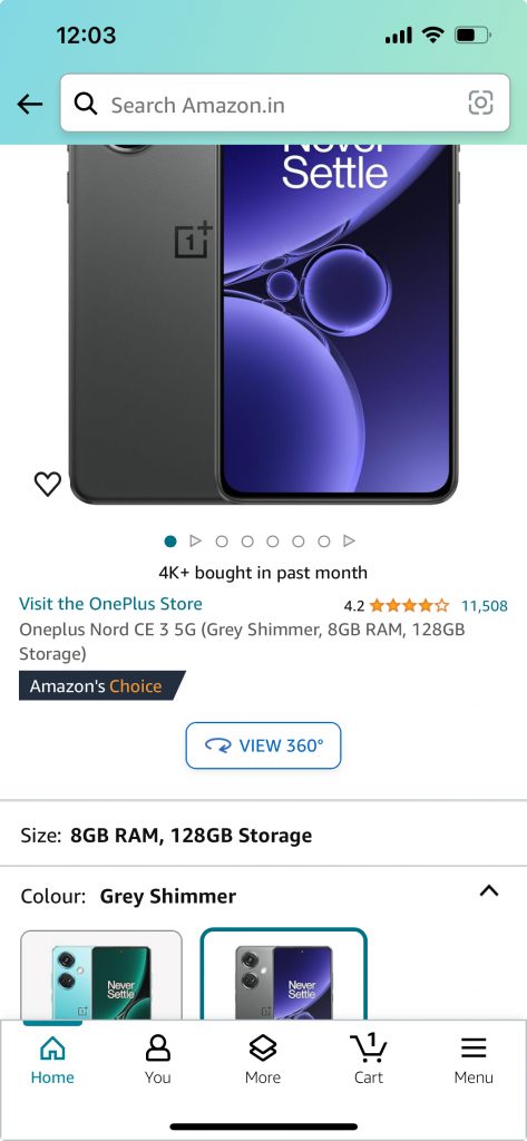
Real-World Example: Amazon’s product pages are a masterclass in this. The large product image grabs attention first, followed by the price, title, and “Buy Now” button. Reviews, descriptions, and recommendations come next. This structured layout makes it effortless for users to process information and make buying decisions quickly.
Check out the complete Product Design Case study for Amazon here!
6. Responsiveness – Design That Feels Effortless Everywhere
We live in a multi-screen world. Your users might start exploring your product on a desktop, continue on a tablet, and wrap up on their mobile phone. Responsive design makes sure your product looks and works beautifully across every device.
Real-World Example: The New York Times. Whether you open their website on a massive monitor or a small phone screen, the experience is seamless. The layout automatically adjusts, thanks to fluid grids and media queries, so that reading an article feels equally smooth everywhere- no pinching, zooming, or “Why is this button so tiny?” frustration.
7. Flexibility and Customization – Your Product, Your Rules
Not all users are the same. Some want dark mode, some need larger text, and some love rearranging dashboards until it “feels right.” Flexibility and customization empower users to make the product truly their own.
Real-World Example: Look at Notion. It’s like a digital Lego set. Users can build anything – from personal journals to company-wide wikis. Templates, layouts, and boards are all customizable, which makes people feel like they’re crafting a workspace tailored to their brains. That’s the beauty of flexibility in product design.
8. Scalability and Adaptability – Growing Without Breaking
A product that can’t scale is like a growing kid stuck in the same old shoes – uncomfortable and frustrating. Scalability ensures that your product can handle an increasing number of users, features, and complexity without compromising performance. Adaptability ensures it works beautifully across devices, orientations, and evolving needs.
Real-World Example: Slack is a shining example. Whether you’re a small team of five or a global enterprise, Slack scales effortlessly. Add more users, create endless channels, integrate dozens of apps – it all just works. Plus, its adaptive design ensures you get the same smooth experience, whether on mobile or desktop.
9. Error Prevention and Recovery – Because Everyone Makes Mistakes
We all make typos or pick the wrong dates when booking flights. The trick is designing products that prevent mistakes – and when errors happen, they guide users to recover easily.
Real-World Example: Expedia does this well. If you accidentally book return dates before your departure date (oops!), the platform catches it instantly. Clear error messages pop up with actionable fixes, preventing frustration before it escalates.
10. Performance Optimization – Speed is the Silent Hero of Great Design
No matter how gorgeous your UI is, if it loads slower than your patience, users will bounce. Performance optimization ensures the product is fast, responsive, and enjoyable under all network conditions.
Real-World Example: Facebook’s mobile app uses lazy loading, in which images and videos only load when you scroll to them. This smart trick reduces data usage and keeps the experience smooth, even on painfully slow networks.
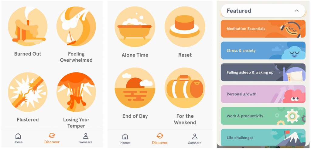
11. Emotional Design – Products That Make You Feel
Great design doesn’t just function – it creates a vibe. Emotional design focuses on making users feel good, safe, inspired, or delighted while using your product.
Real-World Example: Headspace, the meditation app, is a masterclass in this. Its calming nature imagery, pastel colours, and friendly animations make you feel instantly relaxed. It’s not just a meditation app; it feels like a warm, comforting hug for your mind.
Explore the full Product Design Case Study of Headspace here!
12. Ethical Design – Because Great Design Should Also Do Good
Design isn’t just about what looks good or works well – it’s about what’s right. Ethical design means thinking beyond user clicks and revenue to consider the broader impact of your product on society. It’s about building with values like privacy, security, transparency, and inclusivity at the core.
Real-World Example: Take the Brave browser. Unlike most browsers that track your every move to serve ads, Brave flips the script. It blocks trackers and ads by default, keeps data collection transparent, and hands full control over privacy back to users. That’s not just smart product design – that’s responsible design that earns user trust.
Check out the full Product Design Case Study of Brave Browser here!
Your Actionable Toolkit: Free Download
Reading is one thing, applying is another. To help you put these principles into practice today, I’ve created a One-Page Product Design Principles Checklist.
Use it in your next planning session, design review, or PRD creation to ensure you’re building a thoughtful, user-centric product.
Last Two Cents – Mastering Design Principles to Build Product Users Love
Mastering the principles of product design isn’t just a “nice-to-have” skill for product managers; it’s the difference between building something that merely functions and creating something users can’t stop talking about. Whether it’s user-centered design, simplicity, visual hierarchy, or ethical design, these principles act like your secret playbook for crafting products that truly resonate.
The magic of great design lies in understanding how these elements interact – how usability, psychology, and aesthetics come together to create experiences that feel effortless and valuable.
Whether you’re a beginner PM or a seasoned pro, applying these principles with intention can transform your PRDs, design reviews, and even the way you think about problem-solving.
In today’s fast-evolving digital world, products that win aren’t just functional – they’re thoughtful, inclusive, and memorable. By embracing these 12 product design principles, you’ll not only stay ahead of the curve but also create solutions that stand out in crowded markets.
And now that you’ve got these principles under your belt, why not bring them to life with Figma?
If you’re new to the tool, don’t worry, our masterclass on Figma (a favorite of every designer out there) will get you up to speed in just 50 minutes. That’s quicker than a single Netflix episode, and come on, we’ve all binged a few back-to-back without even blinking.
So, the next time you scroll through Instagram or book an Uber, remember – the seamless experience you love is built on these very foundations. Now it’s your turn to design the kind of products that make users say, “Wow, this just works.”
Frequently Asked Questions (FAQs)
Product design principles are a set of best practices that guide how products are structured, designed, and experienced by users. For PMs, they help ensure the product is intuitive, useful, and aligned with user needs.
Yes, while you don’t need to create designs, understanding key design principles helps you communicate better with designers, write clearer PRDs, and advocate for great user experiences.
Design principles like simplicity, consistency, and user-centered thinking help PMs define clearer user stories, prioritize better, and avoid scope creep. They make your PRDs more structured and actionable.
UX principles focus primarily on the user’s interaction and experience, while product design principles also cover broader areas such as functionality, scalability, visual hierarchy, and ethical impact.
Absolutely. These principles are written to be understood and applied by product managers, even if you don’t come from a design or technical background.
User-Centred Design is the best starting point. If you build with the user’s pain points and goals in mind, other principles like accessibility, simplicity, and responsiveness will naturally fall into place.
Yes. Whether you’re building a consumer app or a complex enterprise tool, these principles apply. In fact, principles like consistency, error prevention, and scalability become even more critical in enterprise UX.